Quantcast
Channel: THE BLUE LANTERN
Viewing all 628 articles
Browse latest View live

Koloman Moser: Content Or Context ?

$
0
0


One of the decisions I had to make in choosing the layout for this website was whether the background should be dark or light.  Which would better complement the images and which would make the text easier to read?  If there wasn’t a solution that harmonized both, then what?    If there had been an off-white shade, perhaps slightly textured, I would have picked that because it works well for looking at art in person.  A flat white background produced an ambiance similar to the experience of looking at art in museums where thehard surfaces (stone, concrete, and marble) favored by contemporary architects create a harsh environment, leaching color from  works that were never intended by their creators to be viewed in the equivalent of a commercial coliseum.  Minimalism, relying as it does on maximally sized works, has contributed to the popularity of  large featureless spaces that dwarf all other artworks.


Two new museums opened in 2001, one in New York and the other in Vienna, that offer an illustration of the ways that the arrangement of artworks affects our response to them.   Surprisingly, it is the museum in midtown Manhattan that does the better presentation of fin-de-siècle Vienna.  

The Leopold Collection, located in Vienna’s historic district, now its Museumsquartier, was built after not one but two, architectural competitions and the resulting  museum is as unsatisfactory as you might expect given its genesis.  High ceilings and often harsh lighting dwarf the paintings of Klimt, Moser, and Schiele and the interspersed Wiener Werkstatte furniture looks like toys from a doll’s house, robbed of a sense of their intended scale in its large featureless galleries.
In contrast, the Neue Galerie is housed in a 1914  Beaux-Arts townhouse on Museum Mile, within sight of the Metropolitan Museum. Its original architects were Carrerw & Hastings, the firm that designed the Frick Museum and the New York Public Library, also on Fifth Avenue.  Longtime friends and collectors of Viennese art,  Ronald S. Lauder and Serge Sabarsky chose the German-born architect Annabelle Selldorf to direct the renovation from residence to museum.    In the original marble mantels, sinuous wrought-iron stair surrounds, and  the elegant grids that cover the air ventsSelldorf recognized elements of a total aesthetic compatible with Viennese Art Nouveau, the basis of the Neue Galerie's permanent collection.


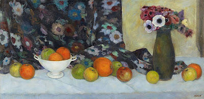
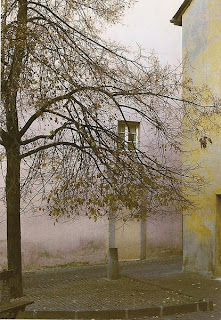
Which brings us to the paintings of Koloman Moser reproduced here.  If Moser’s landscapes remind you of Ferdinand Hodler’s paintings of Switzerland or his flower paintings make you think of the late flower paintings of Edouard Manet, you have identified the major influences on Moser's paintings. Moser had become accustomed to working within a square format as designer for Ver Sacrum, the journal of the Vienna Secession. The grid pattern on the ceramic jug is an allusion to the movement's introduction of geometric patterns into the mixture of Art Nouveau.


These paintings are small (2.5 centimeters = I inch) but you can’t see the individual sizes or relative sizes of images on the internet.  This is hardly a new problem; it is one that has bedeviled art book editors for decades.  Museums with  have greater latitude for making arrangements of artworks on display don't necessarily get it right either.  And that is why I posed the question in the title of this post.  

Viewing artworks on the internet is a recent phenomenon, one that comes with its own limitations.  Texture as well as scale can be difficult to see, and the temptation to alter colors (hue, saturation, lightness,,etc.) is present and not always easy for the viewer to detect when it occurs. The chance to see all kinds of work that has been hard to find is also new, and that is exciting.  These charming landscapes and still life paintings created a century ago by Koloman Moser were intended for the intimate spaces and domestic settings of Vienna are also....here...now.
Images:
1. Koloman Moser - Bergketten, 1913, Leopold Museum, Vienna.  Size: 38 x 50.3 cm.
2. Koloman Moser - Marigolds, 1909, Leopold Museum, Vienna.  Size: 50.3 x 50.2 cm.
3. Koloman Moser - Flowers And Ceramic Jug, 1912,  Leopold Museum, Vienna.  Size: 50.1 x 50.1 cm.
4. Koloman Moser - Wolfgangsee, 1913, Leopold Museum, Vienna.  Size: 32.5 x 32.5 cm.
 

Garish Days

$
0
0


“Now I am 31, or so they say,
With a small poetry business of my own.
Alas, my hair is starting to go gray,
And all my friends are getting overblown.”
 - Erich Kastner


Two of the best books to appear in 2012 are reissues from the 1920s, specifically the Weimar Republic.  One, Microscripts by Robert Walser(1878-1956)  has never been published in its complete form before.  Walser’s reputations as one of the great modernist writers becomes even clearerwith this handsome edition that includes an off-kilter essay by Walter Benjamin and a charming appreciation by Maira Kalman.
Going To the Dogs by Erich Kastner (1899-1974) comes as a surprise.  Poet, novelist, screenwriter, Kastner is known to contemporary readers by his delightful children's book Emil And The Detectives (1929).  A happy coincidence gives license to consider these two writers at the same time.  Kastner, who endured more than a decade in the asylum that was the National Socialist regime in Germany has a darker vision than Walser who spent even more years in a normal insane asylum.  Indeed, Walser himself once declared: "I'm not here to be a writer, I'm here to be a madman."

The period from 1929 to 1933, was one of staggering unemployment as much as runaway inflation in Germany.   Kastner's protagonist Fabian tells his girlfriend Cornelia, “Formerly a gift and a commodity were two quite different things.  Now a gift is merely a commodity that can be bought for nothing.” Social relations were strained to breaking by the need to move in search of work.  Sexual relations were often reduced to little more than a room for the night. All these changes are presented most obviously in the lives of women.  For Kastner the sexual disarray that resulted from the economic freefall revealed more about the health of society than the morals of  individuals.   

 Night clubs had proliferated during the first world war when public dancing was forbidden, and became emblematic social life in Weimar Berlin,   In his book Weimar Etudes Henry Pachter remembered: “Going through the memoirs of some famous people who had access to high society …. I get the impression that they were all writing about the same party, the same one-legged prostitute, the same supplier of cocaine.”   Contemporary readers take pause; Kastner's unsavory cabaret spectacles and bars where patrons communicate by telephone from table to table and women dance in cages have become commonplaces today.


When we meet Jacob Fabian, he is ‘aged thirty-two, profession variable, at present advertising copywriter.’ At the Exotic Bar he is picked up by an attractive woman who takes him home with her.  Fabian feels compromised, however, when  her husband offers him an allowance if he consents to become a regular.  Fabian's landlady is also compromised, a voyeur who spies on her lodgers through keyholes.

Fabian does a lot of walking in the city but for him, it solves nothing.  Aimless, enervated by the impossibility of a normal life, he observes himself with the same detachment he brings to street-shootouts between Fascists and Communists,   most of them unemployed.   These brawls resolve nothing but suit the authorities just fine, he thinks to himself as he turns away.  Fabian loses his job, his girlfriend Cornelia abandons her stduies to work for the sleazy filmmaker Makart, and his friend Labude commits suicide, the victim of a cruel hoax   When Fabian finally commits a moral act, jumping into the river to save a drowning boy, we are told he cannot swim.  A hideous metaphor, but all too apt.


The public that had been charmed two years before by the sweetness of Kästner’s vision inEmil and the Detectives reacted with indignation to his diagnosis of social decay in Going To The Dogs.  Bertolt Brecht's Threepenny Opera (1928) hadcouched its scathing portrayal of the metropolis in a heady blend of cabaret-style music with the classical avant-garde.  Alfred Doblin's modernist montage of a novel Berlin Alexanderplatz (1929) tested the endurance of its readers with its dark and lengthy tedium.  Better known is British expatriate Christopher Isherwood's Mr. Norris Changes Trains (1935) which has had several reincarnations, first as the  play I Am A Camera in 1951and as a musical Cabaret (1966) and then a movie of the musical (1972).
Kastner, born in Dresden in 1899,  was marked by the fate of his parents: his father, a craftsman forced into low paid factory work by industrialization and his mother, a genteel woman who became a hairdresser and took in boarders to make ends meet  Yet Kastner managed to attend  teacher’s college and earned a doctorate in literature
When the Nazis came to power, Kastner was in Switzerland.  So, while his friends were busy escaping from Germany, Kastner was trying to get back in to care for his elderly  mother.   In the event, he remained throughout the war,  surviving multiple interrogations by the Gestapo only on account of the immense popularity of Emil and the Detectives.


Why Robert Walser chose to write  stories on strips of paper in an imitation of medieval German script is difficult to pin down.    Exactly when he began writing his little pencil stories is unclear but, taken altogether, they constitute a miniature world that we recognize as ours.  Walser explains his method best.   "(C)haracters in books  stand out better, I mean, more silhouettishly from one another, than do living figures, who, as they are alive and move about, tend to lack delineation.”
 “We don’t need to see anything out of the ordinary.  We already see so much.”

Listening to the radio, riding in an automobile, or waiting for a train, he reacted to modern technology with attentive interest.    “It’s almost romantic to think that in all these countries, be it in the sunlit daytime or at night, trains are indefatigably crossing back and forth.  What a far-reaching network of civilization and culture this implies.  Organizations that have been created and institutions that have been called into existence cannot simply be shrugged off.  Everything that I achieve and accomplish brings with it obligations.  My activity is superior to me.”

Walser's life reads like the plot for a novel by Franz Kafka: a bank clerk and a butler in a Silesian castle ends his days as an inmate in an asylum.   The Swiss-born Walser spent more time at the Waldau Sanatorium  in Berne (twenty-three years)  than he did in Berlin, from 1905 to 1913.   While in Berlin, Walser published three novels.  He was productive and optimistic there. Subsequent developments made him unable to support himself in the metropolis and, downcast, he moved on, the one constant in a peripatetic life that may have made the asylum seem welcoming.   Although Walser recognized the lineaments of mental illness in himself, he attained an enviable wisdom.   His writing is replete with the coming and going and coming and going of what we think of as happiness, "the shakiest of things and also the most solid."


Going To The Dogs by Erich Kastner, translated from the German by Cyrus Brooks, New York, New York Reveiw Books: 2012 (1931) .
Microscripts by Robert Walser, translated from the German by Susan Bernofsky, New York, New York Review Books: 2012.

Images:   Dodo, given name: Dorte Clara Wolff (1907-1998)  The artist studied at the prestigious Reimann Art School.  She had a successful career in fashion illustration but is best known for her caricatures that appeared in the satirical magazine Ulk, published in Berlin.   If you think her images portray alienation between women and men, you have understood her work.
1. Wedding At The Dachgarten, 1929, Kunstbibliothek, Berlin.
2. Madame Baker, reprinted from Ulk, 1928, State Museum, Berlin.
3. In The Loge, 1929, reprinted from Ulk, State Museum, Berlin.
4. The Hero, 1928, State Museum, Berlin.
5.Sisters, 1928, Jewish Museum of London, UK.
6. The Man With The Glacier Eye , 1928, Jewish Museum of London, UK.

February At The BNF

$
0
0


“Fat lot I care, husband, about your love
Now that I have a friend!
He looks handsome and noble
Fat lot I care, husband, about your love.
He serves me day and night
That is why I love him so.” 
-       one of  a group of lais collected by Ria Lemaire in Female Power In The Middle Ages, Copenhagen: 1986.

I can think of more than one way to look at this playing card with the caption  Concert de ganaches.  If you associate the word ganache with a smooth mixture of chocolate and cream, then this must be a smooth performance. But the use of the word ganache in the food lexicon resulted from a mistake made by an apprentice chocolatier.  The mixture he whipped up wouldn't harden and his master called it stupid.  In French slang, to call someone a ganache can mean you are calling the person a blockhead!  So Concert de ganaches could be a rough night at the concert hall.

As for the lai reprinted above, an octosyllabic poem whose origin is traced to Marie de France (late 12th century), it comes down on both sides of the rough/smooth question.  A ganache for all seasons.
Image: unidentified  artist - Concert de ganaches from Neuf cartes d'un Jeu des cartes grotoesques, ca. 18001869, Bibliotheque Nationale de France, Paris.

Gallerinas

$
0
0

TO MADAME M. ON HER WAY TO BUY A PLATE

"1.
There are generations, and cities, and peoples,
Sad and old –
That left us no great masterworks,
But -  a few pots!
2.
In a museum a lady stands with a parasol
Before such a pot;
While in Sicily (even though Polish!...) she doesn’t know
Upon whom she treads!...
3.
When peoples – you’ve no pity about their fate
In epoch’s chasms –
Vanish – like the butler who serves the plate
To the esteemed Madame."
-         dated  Day 3, year 1869, Cyprian Norwid, from Poems,  translated from the Polish by Danuta Borchardt, Brooklyn, NY: Archipelago Books, 2011.

(Cyprian Norwid (1821-1883).  Like his more famous compatriot Chopin, Norwid chose a life of exile, traveling throughout Europe. Russia, Prussia, and Austria had divided Poland in the 18th century, much as Germany was to be divided for a time in the 20th century,  with the addition of suppression of the Polish language.  A battalion of the Russian Army sacked the Zamoysky Palace in Warsaw, throwing all its treasures out the windows, including the grand piano that Frederic Chopin had played.  He died in a Polish hospice in Paris.)

There are hundreds of art galleries in Manhattan and women work in them.   This unremarkable fact became the occasion for something like ridicule in October.  Vogue dubbed the women who work for global art dealer Larry Gagosian, the "Gagosiannes" in an article.  Not to be outdone, New York's The Cut, a fashion blog, suggested that the women were more enjoyable to look at than the art on the gallery walls.   And, coincidentally, Mindy Kaling in her New Yorker piece Flick Chicks, included "The Woman Who Works In An Art Gallery" in a list of characters who appear in movies but don't actually exist.  Like the dodo bird, perhaps?    And yet, the term "gallerina", a diminutive that used to refer to women who dabbled in art appreciation, is commonly used to denote a lack of seriousness among all those women who do, in fact, work in galleries and museums. 
When Edgar Degas painted his friend - and fellow artist - Mary Cassatt - touring the Louvre Museum in 1879, women were only beginning to venture to public spaces without male escorts.  A common theme in Art Nouveau posters and drawings is the woman perusing works for sale at an art gallery and, it should be understood as it was by contemporaries, the woman was engaged in a slightly risque activity.  The arched eyebrow, the knowing look, the smirk of complicity; all these are subtle ques that suggest a departure from the normal order and something a bit risible.  Old habits die hard.

Images:
1. Edgar Degas - Mary Cassatt At The Louvre, 1879, private collection.
2.Amphora, ca. 27 BCE - 68 CE, a pot of Roman or Etruscan origin, Metropolitan Museumof Art, NYC.

The Paradox That Is Emil Orlik

$
0
0

What strikes me about Emil Orlik's Japanese Garden is how like a Secessionist's dream it is, with not a cherry tree in sight.  Orlik’s prominent placement of a flowering bush and  seemingly random spray of blossoms at the forefront of the picture seem to have gravitated from a Klimt landscape.  Every element in this picture belongs to an elaborate but apparently simple curve: the trees, the path, and the all-important horizon bend to the artist's design.      If any single image can encapsulate Orlik's aesthetic this could be it.  Also, it shows how western artists rediscovered things like abstraction, the reality of the flat surface, and decoration as a value in itself, all of which had been suppressed in the drive to imitate reality - or at least how our eyes perceive it.


Steeped in Secessionism, Orlik had lived in Munich, Berlin, and Vienna  when he embarked on his momentous but modestly described Reise nach Japan (Trip To Japan).  From March, 1900 to November, 1901  the 30 year old Orlik studied with masters of the wood block, determined to   learn every aspect, just as he had studied copper engraving at the Academy in Munich.    He wrote enthusiastically about his Japanese experiences to his friend the poet Rainer Maria Rilke who turned his insights into articles for Ver Sacrum, the journal of the Viennese Secession group where Orlik had also worked.  Orlik's first prints had been published by Jugend magzine in Munich in 1897, after he had moved there fromp his native Prague.      


In his graphic works Orlik often employed  techniques of shading and  intensely compacted lines,  straight out of his European academic training.    The Leafless Tree, a work that makes me think of Xavier Mellery's Last Leaves Of Autumn (1893) is one of the most fully harmonized of this type.  In it, Orlik married the expressive technique to an atmospheric Ukiyo-e theme.  He succeeds in capturing a sense of movement in a medium that often appears static.  I don't think it is better than Woman Carrying Wood in Winter, just different.


 His paintings, on the other hand and at their best, were made in a flat, decorative style that western artists were in the process of appropriating from the Japanese  prints at the turn of the century.  Still Life With Fruits and Flowers in a Vase exists on two flat planes: the table with its artfully scattered accoutrements and the decorative backdrop. As a painting it is enjoyable but more importantly, it shows why Orlik enjoyed the various forms of making prints so much.   His tongue-in-cheek image of himself sketching the rising sun in a poster for an exhibition at the E. Richter Gallery suggests what gave Orlik his deepest artistic satisfaction.


Images:
1. Emil Orlik - Japanese Garden, 1904, Villa Griesbach, Berlin.
2. Emil Orlik - The Japanese Painter Tomonobu, the Woodcutter, and the Printer, In Japan, triptych, 1903, Vervielfaltigende Kunst, Vienna.
3. Emil Orlik -Before the Temple, ca. 1901, Galerie Bessange, Berlin.
4. Emil Orlik - Woman Carrying Wood In Winter, 1903, courtesy Emil Orlik Prints.com
5. Emil Orlik - The Leafless Tree, reprinted from Etchings and Otehr Graphic Arts by George taylor Plowman, New York: 1914.

6. Emil Orlik - Still Life with Fruits and Flowers in a Vase,  1930, Kunsthaus, Lempert.
7. Emile Orlik -  poster for Kunst Salon E. Richter, Albertina Museum, Vienna.

Autocrats Of The Autoroute

$
0
0


L'automobile, c'est francais!
Americans think of Henry Ford, but the automobile's early development was a competition between French and German inventors.  There was Leon Bollee who invented the Tricycle Bollee,  a three-wheeled vehicle, with the passenger seated in front of the driver, that reached the unprecedented average speed of 28 mph in the Paris-Tourville road rally of 1897. The firm of Panhard et Lavassor, founded in 1889, was the first company devoted exclusively to manufacturing automobiles.  Sensing an opportunity, the Peugeot Company followed suit, switched from the manufacture of coffee grinders to automobiles.


The French claim competitive bike racing began at the Parc de Saint-Cloud in 1868.  Their claim to  road racing is the Gordon-Bennett Cup sponsored by The New York Herald newspaper.   Inaugurated in 1900, the route from Paris to Lyon was a 392 km (244 mile) circuit through the French countryside, a hair-raising experience for drivers and spectators alike. 
Like bicycle racing, the four-wheeled racers became figures of glamor to the general public.  Camille Jenatzy, a Belgian racer, who won the 1903 cup was nicknamed the Red Devil for the color of his beard,  Jentazy had been the first to break the 100 km speed barrierback in 1899 in a bullet-shaped Mercedes, La Jamais Contente (The Never Satisfied). He predicted his death-by-Mercedes, but no one could have guessed the way it would come about. After being shot accidentally by a hunting companion, Jenatzy bled to death as he was being taken to a hospital - in his Mercedes.
When a Dutch engineer named W. Valdepoort referred to drivers  as Autocrats in The Selfish Car (1953)he tapped into a continuing skepticism about the automobile, despite its ubiquity in the modern life.

Take  automobile clubs which originated for the privileged few who enjoyed a freedom of the road that no contemporary driver stuck in traffic will ever experience. The clubs published guides listing "autophobic" towns where the locals had demonstrated their displeasure at noise, dust, and dangers posed by speeding vehicles.
As if to confirm the worst fears of pedestrians, Octave Mirbeau wrote:  “How frustrating, how thoroughly disheartening it is that these pigheaded, obstructive villagers whose hens, dogs and sometimes children I mow down, fail to appreciate I represent Progress and universal happiness.  I intend to bring them these benefits in spite of themselves, even if they don’t live to enjoy them!”  - (Sketches of a Journey– 1908)

Magarete Witte, an early auto tourist from Germany, wrote in 1905 that "a journey through Holland is dangerous since most of the rural populace hates motorists fanatically. We even encountered old men, their faces contorted with anger, who, without any provocation, threw fist-sized stones at us."  The arrogant driver would become a stock subject for illustrators, and little wonder. What Witte failed to mention was that German traffic laws allowed hit and run drivers to leave the scene of an accident without reporting it to the authorities.


Americans owe the posting of speed limits to the reckless driving of a wealthy hobbyist, William K. Vanderbilt, who was given his first motorized vehicle – possibly a Tricycle Bollee – at the age of ten. (That's a Tricycle Bollee in the illustration by Andre Helle where the woman chases the rabbit.)  In 1904, William K. sponsored the first road race in America near the Vanderbilt family estate on Long Island.  Encouraged by the success of the annual Vanderbilt Cup, in 1909 he financed construction of the nation’s first road solely for the use of automobiles, the Long Island Motor Parkway.
Constantly looking for new routes, Vanderbilt motored around Europe, where he was forced to flee angry mobs after he killed two dogs in Pau and injured a Tuscan child while motoring through France in 1902.   A group of normally peace-loving Swiss beat him and threatened to burn his car until the police intervened.


"Pedestrians make up the greater part of mankind. Not only that, the finer part. Pedestrians created the world. It was they who built towns, put up skyscrapers, installed drainage and plumbing, paved the streets and lit them with electric lights. It was they who spread culture all over the world, invented painting, thought up gunpowder, built bridges across rivers, deciphered the Egyptian hieroglyphics, introduced the safety razor, abolished slavery, and discovered that a hundred and fourteen tasty, wholesome dishes could be made from beans.
And then, when everything was ready, when our planet had acquired a comparatively well-planned appearance, the motorists appeared.


It should be noted that the motor car was also invented by pedestrians. But for some reason the motorists soon forgot about that. They began to run over the meek and mild, clever pedestrians. The streets built by the pedestrians passed into the hands of the motorists. The roads were doubled in width and the pavements were narrowed down to the size of a tobacco wrapper. The pedestrians began to huddle against the walls of buildings in alarm."
 -   from The Golden Calf by Ilf and Petrov, translated from the Russian by John H. Richardson, Frederick Muller Limited, London: 1962 (1930) 


Ilya Ilf (1897-1937) and Yevgeny Petrov (1903-1942)were the authors of the classic Russian farce The Twelve Chairs.  No one has ever adequately explained how these anarchic humorists avoided censorship - or worse - during the early decades of Soviet rule.  Both men died prematurely:  Ilf of tuberculosis and Petrov in a plane crash, victims of the same anarchic fate they managed to wring every ounce of laughter from in books.
In 1935, on special assignment for the Moscow newspaper Pravda, the two spent ten weeks criss-crossing the United States in a Ford motor car.   Ilf took this photograph with his Leica; it is reprinted from Ilf & Petrov's American Road Trip (published by Princeton Architectural Press: 2006).  Like (Vitaly) Komar & Alexander) Melamid, those single-name, satirical students of art, they belong in the pantheon of absurdist truth tellers.
Like Ilf & Petrov the illustrators, many of them anonymous,  left a visual record of early auto history convey the absurdity of  humans on wheels
Images: from the collection of the Musee de Voiture, Compiegne.
1. Anonymous - The Sovereigns, c. 1905.
2. Maurice Blais -  Mountain Road, c.1900-10.
3. Georges Meunier - untitled.
4. Andre Helle - Tricycle Bollee, ca. 1898.
5. Anonymous - Jenatzy In his Winning Mercedes-Benz.
6. Anonymous - The Driver, 1904.
7. Anonymous - Le cul-de-jatte, ca. 1900-10.

Loie Fuller & Joseph Paget Fredericks

$
0
0

A swirl of blues and greens....an ocean wave....a woman in motion.    By all accounts, when she danced, Loie Fuller dominated the stage as definitively as The Great Wave Off Kanagawa dominated Mount Fuji in Hokusai's Thirty-six Views of Mount Fuji. Whatever they meant by it, critics likened Fuller to a force of nature.  In Joseph Paget-Fredericks' gouache, Loie Fuller performing Claude Debussy's  La Mer (inspired by Hokusai) is a wave in human form.   To achieve that effect Fuller converted a staircase and hundreds of square feet of silk into lapping waves. Pavel Tchelitchew, who later designed several ballets for George Ballanchine, remembered the 1925 performance for its  "dreamlike costumes of trailing silk and its phantasmagorical lighting."

Loie Fuller  (1862-1928) was  in images more than any other performer of her  time: Toulouse-Lautrec, Koloman Moser, Jules Cheret,  Joseph Paget-Fredericks (1905-1963), who became a painter, choreographer and designer, also knew Fuller as a friend from his childhood.

Fuller's parents ran a boardinghouse in Chicago.   Joseph's mother, Constance Paget, was the daughter of a British journalist whose family had made a theatrical museum at their home and his father Arthur Remy von Hohenthal Fredericks was the nephew of the Russian arts minister who arranged for the Ballets-Russes to appear in Paris in 1909.

Fuller's first appearance at the Folies-Bergere on Nov. 5, 1892  created an impression as forceful as that of the Ballets Russes. Young girls copied her clothing and mannerisms.  Stephane Mallarme, who saw her perform a few months later, wrote:“(She) is as once an artistic intoxication and an industrial achievement…. She blends with the rapidly changing colors which vary their limelit phantasmagoria of twilight and grotto, their emotional changes, delight, mourning, anger…”
But La Loie, as the French dubbed her,  was no ingenue.    She had toured the Midwest with Buffalo Bill Cody at age 21, acted on Broadway and, when unemployed, had lied her way into a dance troup. “When you are starving you sometimes forget to be strictly truthful.”
Untrained in classical ballet, Fuller figured out that if she wrapped herself in cloth and waved her arms she could create powerful visual effects. She was never comfortable being called a dancer but  if the term performance artist had been in use a century ago it would have suited her.    Her choreography made modern dance possible, her use of stage lighting was an innovation in color, she danced on a mirrored floor  in London.  Andre Levinsohn, the French dance critic recognized all that.  “She is a great imaginative creator of forms.     Her drapes animate and organize space…abolish geometrical space….”
In 1905 Pathe of France filmed Fire Dance,  one of her signature pieces.  With slow motion filming, shadow casting and negative images imprinted on the film stock, a twirling figure was transformed into a moving kaleidoscope.  Riveted viewers reached for comparisons to a butterfly or an orchid.

 The Paget-Fredericks home in San Francisco was full of art collected by Constance and theatrical memorabilia, Arthur's specialty.  A successful businessman and philanthropist and his cultured wife made an ideal couple to entertain visiting performers, Loie Fuller, Isadora Duncan, Vaslav Nijinsky, and Anna Pavlova among them.   
An impressionable, artistic young boy absorbed it all sponge-like.  Joseph presented "An Hour of Dance Impressions by Joseph Paget-Fredericks" at Berkeley when he was only sixteen.
He attended the University of California and then in Europe he was tutored by Leon Bakst and John Singer Sargent.  Together, Bakst and Pavlova sponsored his first exhibition in Paris.  He  became the art director for Pavlova's world tours in 1932 and 1933.   Paget-Fredericks designed the 1941 production of Tchaikovsky Swan Lake for the San Francisco Opera.  Had he lived longer to write the books he planned, Paget-Fredericks might be as well known as the dancers he painted.


Related article posted here April 7, 2011 - Airborne.
by: Joseph Rous Paget Fredericks, undated, from the collection of the Bancroft Library, University of California, Berkeley.
1. Loie Fuller Performing Debussy's La Mer ca. 1925.
2. Loie Fuller - Fire Dance.
3. Loie Fuller - Serpentine Dance.
4. Loie Fuller.  

March At The BNF: Mardi Gras

$
0
0
At first glance it looks like the cover of Vogue or Vanity Fair  but Bal de la Fourrure is a poster.  By 1930, when this was printed, magazines had taken over from the poster as the medium where new styles in the graphic arts were born.  A fur ball at Mardi Gras time is pure visual conceit: a holiday that is the first celebration of the coming spring includes a parade (outdoors, need I say) where the libations consumed have been known to free people of their inhibitions and their clothes.  

Charles Gesmar (1900-1928) was precocious, a lucky thing for he died at 28 from pneumonia.  His first known drawing dates from 1912 and shows his mother walking through a door.  By the time Gesmar was fifteen The son of a fabric merchant, Gesmer  knew that he wanted to become a designer by the time he was fifteen.   At sixteen he began his association with the music-hall star Mistinguett, designiong her costumes and creating for her an indelible graphic image in posters.  When the duo played in New York in November 1923, the Times noted that the revue put more gold on the costumes and less fabric on the girls than they had ever seen.   
Ideas seem to flow from his pencil and when Gesmar began to make money it flowed from his wallet.  Mistinguett called the speed "frightening."   He paid for taxis with hundred franc notes and developed a taste for opium - never cheap. In the event, Charles Gesmar died as quickly as he had lived.

Image:
Charles Gesmar - Bal de la Fourrure, March, 1930, Bibliotheque Nationale de france, Paris.

Beauty Manifested In Use: Charlotte Perriand

$
0
0
"Lenin is seated at the Rotonde on a cane chair; he has paid twenty centimes for his coffee, with a tip of one sou.  He has drunk out of a small white processional cup.  He is wearing a bowler hat and a smooth white collar.  He has been writing for several hours on sheets of typing paper.  His inkpot is smooth and round, made of bottle glass." *  -  (If you skimmed this paragraph, go back and read it again, slowly.)

Who writes this stuff, I asked myself irritably as I turned the pages to check the footnote.  Second rate historical fiction?  Over digested creative writing assignment? Highly regarded manifesto of modern design?  Yes, it's  Charles Edouard Jeanneret, the man who also had the poor taste to reject Charlotte Perriand when she applied to worked in his atelier in 1927, dismissing her with the comment "we don't embroider cushions here."
Undaunted by his condescension, Perriand renovated her Saint-Sulpice,  apartment into a design studio of her vision of modern architecture and design.    That's Perriand at left in her  'bar under the roof,' that became famous as Perriand's Mobilier Metallique.  Her solutions to the small spaces  of modern urban living are ours, now. She mirrored the  surfaces on furniture and walls,  enlraging them visually.   She designed tables and chairs that functioned as modular furniture.   The next year, dazzled by her virtuoso use of chrome, glass, and aluminum, Pierre Jeanerret persuaded his cousin to think again and a collaboration began,  one that allows lazy historians to minimize Charlotte Perriand's achievements to this day. 
Today, Charlotte Perriand (1903-1999) is remembered for her decade long collaboration with Le Corbusier (the name Charles Jeanneret made up to differentiate himself from his talented relatives, including his cousin Pierre Jeanneret who persuaded him to take another look at Perriand's work).  More significant, I think was her encounter with  yo no bi, a concept from Japan that means "beauty is manifested in use."

Perriand met Junzo Sakakura, the Japanese ambassador to France, like her also an architect when he designed the Japanese pavilion for the 1937 Paris World's Fair.  Although he modeled it on the Katsura Palace, he used the materials of 1920s modernist design, thin steel and sheets of glass, achieving a cross-cultural idea of transparency and simplicity.  The French liked it very much.
Sakaura arranged an invitation from the Japanese Ministry of Commerce for his friend to visit Japan.  You may wonder why Perriand wanted to  leave home for a country halfway around the world that was obviously preparing for war, but she embarked from Marseilles by boat for Tokyo the day after Nazi soldiers marched into Paris.  
While in Tokyo, Perriand lived at the Imperial Hotel,  designed by Frank Lloyd Wright in 1922..   Seeing traditional Japanese crafts and learning vernacular techniques for weaving furniture took Perriand out of the city The experiences resulted in  Selection, Tradition, Creation, the exhibition she  developed for the Takashimaya  department store chain, combining furniture designed by Perriand and constructed in Japanese workshops with  traditional ceramics and lacquer work.  Perriand may have been inspired by her former teacher Maurice Dufrene, who directed  a design workshop La Maitrise for galreies lafayette in Paris.  
Perriand was deported  as an enemy alien in December, 1942, and spent the rest of World War II in exile in French Indochina.

 In her designs, Perriand embodied the harmony that comes from cohesion between internal and external spaces that is the aesthetic ideal  in Japanese architecture.     It must count as a twist of fate that Perriand's stackable chairs, known as the Perriand are often thought of as Japanese.   another similarity betwwen France and Japan: women were not granted the right to vote until 1946.  Perriand's real designs are, ultimately, more persuasive than Le Corbusier's imaginings.  Equally, we should be undaunted by attempts to write women out of design history, another feat of imagination.  As for Le Corbusier, Jeanneret, Leger, and the others,  Charlotte Perriand outlived and outworked them all. 

Charlotte Perriand et le Japon is an exhibition that originated at the Museum of Modern Art, Kamakura, Japan in 2012 and is on view at Musee d'Art Moderne de Saint-Etienne Metropole. Saint-Priest-Jarez, France from February 23 to May 26, 2013.

* excerpt from L'Art decoratif aujourd'hui (The Decorative Arts Today) by Le Corbusier, translated from the French by james I Dunnett, Cambridge, MA, MIT Press: 1987.


Images: 
1. unidentified photographer - Le Corbusier & Charlotte Perriand, 1939, Fondation le Corbusier, Paris.
2. Charlotte Perriand - Self-portrait In Her Studio, 1927, ADAGP, Paris.
3. Charlotte Perriand - ash bench for Etienne Sicard residence in Tokyo, 1941, Charlotte Perriand Archive, Paris.
4. Charlotte Perriand - modular furniture, no date given, Musee des Arts decoratifs, Paris.

Dreaming Of Spring

$
0
0
"In Nature's temple living pillars rise,
And words are murmured none have understood,
And man must wander through a tangled wood
Of symbols watching him with friendly eyes.
 
As long-drawn echoes heard far-off and dim
Mingle to one deep sound and fade away;
Vast as the night and brilliant as the day,
Colour and sound and perfume speak to him.
 
Some perfumes are as fragrant as a child,
Sweet as the sound of hautboys, meadow-green;
Others, corrupted, rich, exultant, wild,
 
Have all the expansion of things infinite:
As amber, incense, musk, and benzoin,
Which sing the sense's and the soul's delight."
Correspondences 'is reprinted from The Poems and Prose Poems of Charles Baudelaire. Ed. James Huneker. New York: Brentano's, 1919.

Using the blunt ax of professional jargon, these artworks form a 'visual cluster, ' a term intended  to differentiate how we experience their proximity to each other from iconography.  Each one has an individual consent and meaning to the viewer.  The poet Charles Baudelaire gave this experience a name: Correspondences.   I like best the theory elaborated by the German polymath Aby Warburg in the 1920s in his Mnemosyne Atlas, a panoramic survey of images across time and space that he further described as " a picture series examining the preconditioned antiquity-related expressive values".    In short, there is an affinity between artworks that  stimulates and satiates us at once.
P.S. Another affinity, a personal one I just recalled, something seasonal - Lilian Gish appears in How I Feel About Winter, posted here January 5, 2009. 


Images:
1. Edward Steichen - Lilian Gish, Vanity Fair, December, 1932.
2. Suzukia Harunobu - Dreaming Of The First Days Of Spring, 18th century, Musee Guimet, Paris.

From Fukagawa To Munich: Peter Behrens

$
0
0


He did his best work as an architect and designer but, whether you recognize his name or not, Peter Behrens (1866-1940) is most familiar for a woodblock print from Pan. a short-lived literary magazine published in Berlin from 1896-1900.  Whenever there is a revival of interest in Art Nouveau,  there is The Kiss.   Behrens gave the woodblock print to his friend, the poet Richard Dehmel, who displayed it in his dining room.
Printing from woodblocks was one aspect of the late 19th century interest in all things Japanese.  I had not thought particularity  of Peter Behrens in that connection until I saw Storm, a print Behrens made the year before The Kiss.  Obviously a reinterpretation of one of Hiroshige's 100 Famous Views of Edo (Tokyo), Behrens drew freely on the extravagantly curvilinear  style popular among the artists of Pan and Jugend, especially his friend the influential Otto Eckmann.


 Behrens removed any signs of human habitation from the landscape to make room for the play of wind and waves.  The absence of waterbirds also has the effect of making the eagle seem less menacing.  The eagle's wings curve in harmony with the imaginary lines of the wind; he might almost be mistaken for  a kite on a windy day.   In Behrens's version the large bird functions as a framing device, similar to Hiroshige's use of a giant paper lantern in Kinyruzan Temple Asakusa, another of the 100 Views.   Behrens gave Storm to the playwright Otto Hartleben who hung it in - his dining room! 


Images:

1. Peter Behrens - Sturm (Storm), 1897, State Museum, Berlin.
2. Peter Behrens - The Kiss (Der Kuss),  1898, Musuem of Modern Art, NYC.
3. Utgawa Hiroshige - Kinryuzan Temple, Asakura, July, 1856, Broolyn Museum. 
4. Utagawa  Hiroshige - Eagle over the Fields of Susaki at Fukagawa, May, 1857, Musee Guimet, Paris.

Articles posted here on another contemporary dining room, this one designed by Lucien Levy-Dhurmer and reconstructed for display at the Metropolitan Museum in New York City:

1. The Wisteria Dining Room - March 22, 2010.
2. Lucien Levy-Dhurmer At The Metropolitan, May 27, 2008.

Nouveau Risque

$
0
0
For those who don't read French, the poster at left announces an exhibition of  pictures and drawings in Paris, but you probably recognize the artist Jules Cheret's style.  Cheret chose to include this work from 1888 in the collection he named Les Maitres de l'Afiiche and the Syracuse University Art gallery chose the collection as the centerpiece for their recent exhibition Nouveau Risque: A Perspective on Women and Progress.
Published in Paris as a monthly subscription, similar to a magazine, from December 1895 to November 1900, The Masters of the Poster was the inspired marketing idea of the man now considered the father of the modern poster, Jules Cheret (1836-1932).  At the same time the series made reproductions of artworks available at reasonable prices, Cheret was also elevating the poster to the realm of art.  He may have been familiar with a previous but unsuccessful attempt by the publisher Cadart who, in 1862, assembled a portfolio that included works by Edouard Manet. 

I remember the anticipation I felt as a child when a package  arrived each month in the mail  from the Metropolitan Museum of Art.  Similar to Cheret's portfolios,  the museum's  booklets (on an artist or a special subject) came with  a large sheet of glossy color images that could be detached and mounted on the appropriate pages   What was also similar was the ingenious combination of art for appreciation and  elucidation.   You could even collect the booklets in sturdy melon-hued cardboard folders, stamped in gold lettering.  From that experience, I can teleport myself to Belle Epoque France for the delivery of  Les Maitres de l'Affiche


Cheret is also notable for his signal creation of a type - the Cherette - a young woman definitely nouveau in her day and slightly risque.   Whether attending cafe concerts and cabarets or strolling the sidewalks, stopping to inspect some of the newly available consumer goods for sale, (art prints were a frequently depicted example), she was neither recgonizably a respectable matron nor a working class servant.   

A survey of working Parisians taken during the 1890s found that one in ten was involved in the production and maintenance of clothing. From dressmakers, cobblers, and milliners to laundresses and seamstresses it took a legion of poorly paid workers to keep the population washed and dressed.  Many women thus employed had little choice but to supplement their meager wages with prostitution.  It was to this fact, in part, that women appearing in public alone or together but without a male escort were seen as risque.

Great improvements in color lithography came along just in time to record the first stirrings of women's emancipation, a work  still in progress today. Out of the three primary colors, red, blue, and yellow, and influenced by the Japanese ukiyo-e prints that were the rage in Belle Epoque Paris, Cheret created a style that was originally seen in the street and then on the walls of art salons and eventually the homes of the bourgeoisie. 


Having taken some modest steps into the life of city streets, the turn of the century woman began to try other activities.  Tennis and bicycling, as we know well, are activities that call for  clothing other than ordinary street-wear.    But the split skirt or culotte was a new and daring outfit, so a sensible young woman would have a male escort at her side when she ventured out thus attired. 
Nouveau Risque, the exhibition, includes other artworks from the period, including favrile glass pieces from the Tiffany Studio. What is  most interesting and apropos, for me, is the Diana, a woman's bicycle produced by the Cortland Wagon Company in upstate New York in 1894.  It large rubber front wheel is red and the bicycle measures 45 inches in height.   The bicycle, like the automobile, has been a vehicle of mobility and freedom, precious commodities in the lives of women,  then as now.
 The 'Women's Edition' unlike the ghetto that was regular women's pages in newspapers a century ago, allowed them to particulate - if only for a day and for charitable fund-raising purposes - in all aspects of producing the paper.  Usually published on holidays, these editions were often referred  to as 'Charity Editions', with what overtones you may suspect.  They were the brainchild of  the then popular women's clubs.  From small town newspapers to the nation's flagship publications such as the San Francisco Examiner and the Buffalo Courier, women took over.  We know little about Alice Glenny Russell, but one thing we do know: she was the rare woman to have her work included in Cheret's series.   Ethel Reed (1874-after 1920) from Boston, somewhat better known, is the only other one I have found.


Nouveau Risque: A Perspective on Women and Progress, an exhibitionat the Shaeffer Art Gallery, Syracuse University, January 24 - March 17, 2013.


Images: Syracuse University Art Galleries, Syracuse, NY.
1. Jules Cheret - Exposition: Tableaux & Dessins de A. Willette, 1888.
2. Maurice Debis - La Depeche de Toulouse The Toulouse Dispatch - a newspaper) , 1892.
3. Georges Meunier - Trianon Concert, 1897.
4. Theophile-Alexandre Steinlen - Two Women Looking at a Window Display, 1896.
5. Ferdinand Misti-Mifliez - Cycles Gladiator, 1896.
6. Alice Russell Glenny - Women's Edition - Buffalo Courier, 1895.
7. Ethel Reed - Miss Traumerei, 1895.

Rhone Maiden: Marguerite Burnat-Provins

$
0
0

It has been three years since I wrote something about the accomplished and underrated French artist Marguerite Burnat-Provins (1872-1952).   It may be that the years she lived in Switzerland that nourished her imagination have contributed to her low visibility, at least  in retrospect.

A shorthand way to visualize the Alps-Rhone River region that straddles the border between France and Switzerland is to think of the locale in Le genou de Claire (Claire’s Knee), Eric Rohmer’s 1970 film shot in the environs of Annecy.   Why do that?  Because the remarkable and little-known Marguerite Burnat-Provins, a native of historic Arras in northern France, fell in love with the region; it marked her art as she marked her adopted home.  


Marguerite Provins first lived in Switzerland following her marriage in 1896  to Adolphe Burnat, an archtiect from Vevey.  The couple were divorced in 1908 and, for a time, Marguerite returned to France.


Vevey, on the shore of Lake Geneva, has long been an auspicious location for fiction.  Part of the novel Daisy Miller (1878), first international success for Henry James, was set there.  Not only do two characters in Louisa May Alcott’s Little Women (1868)  fall in love in Vevey, it is the place where Amy learns of the death of her beloved sister Beth.  Alcott may have chosen Vevey because she met the man who served as model for Laurie there.  Closer to our time, Anita Brooknet set her Booker-Prize winning novelHotel du Lac (1984) at one of the grand tourist hotels on Lake Geneva.  

In 1898 the Swiss painter Ernest Bieler invited Burnat-Provins to  his chalet in the village of Saviese,  in the French-speaking canton of Valais,  The area, known for its fruit farming and vineyards, and its people captivated Burnat-Provins.    She spent several months there each year with a group of artists  known as L'école de Savièse, that flourished from 1880 until the outbreak of World War I.   The only French artist there, Burnat-Provins used the Art Nouveau style and the new expressionism to bear on her subjects.In Blackberries, she shapes the grape vines, not eschewing realism but reinterpreting to Parisian tastes.  The artist opened her own shop A La Cruche Verte (at The Green Jug ) in 1904 to market her decorative works and books.

Two paintings by Burnat-Provins from 1900 display the broad range of her artistic interests.    The Young Girl of Saviese, executed  in a mixture of watercolor, crayon, and pastel, employs the art Nouveau style to bracket her portrait, appropriately,  with panels of the flowers and grape vines of the Valais region. If you look closely you can see glints of blue in the hat ribbons that cvhannel the bright orange sky. It was shown at the 1900 Exposition Universelle in Paris.


Alternatively, in Old Woman from Rouet the artist uses oil paint in thick strokes of color in a way that evokes thoughts of Van Gogh.    Again, the expressionist style but with tongue in cheek, she painted Jarimouche, or The Congested Nose, a token of the allergy season in lush farm country.


A fanciful/decadent element that is apparent in such early works as Salamanders  later metamorphosed into horrific hallucinations for the artist during the war when her family was endangered.  Burnat-Provins would later say that the nightmarish creatures of her dream life came to her and "dictated" her paintings of them.  "I endure them,  cringe as I feel them coming, and cannot help drawing them."   There is a hint here that hallucination may be one of the goads to her prodigious creativity. 


Burnat-Provins married again, this time an engineer from Valais,  Paul de Kalbermatten. For Paul, Marguerite wrote and illustrated Le Livre pour toi (A Book For You), one of her several successful books   Together, they traveled to his projects in Syria, Lebanon, and Morocco. 


Perhaps unsurprisingly,  it fell to an outsider to see the need for the preservation of Swiss culture.  Burnat-Provins founded the Ligue Pour La Beauté in 1905, to preserve Swiss architecture, as well as  "la Suisse pittoresque."  The Société  that exists today is the direct descendant  of that organization.
Marguerite Burnat-Proins died in 1952 at Grasse, in the Alps-Maritime, in her native France.


Images: unless otherwise noted, reproduced from Marguerite Burnat-Provins: De l'Art nouveau à l'art hallucinatoire..
1. carte postale - Place Marguerite Burnat-Provins - Sion,Switzerland, Association pour la sauvegarde de la cite historique et artistique de Sion.
2. Marguerite Burnat-Provins - Jeune fille Saviese (Young Girl from Saviese), 1900, Foundation Neumann, Lausanne.
3. Marguerite Burnat-Provins - Mures (Blackberries), ca. 1904.
4.. Marguerite Burnat-Provins - Vielle aux Rouet (Old Woman from Rouet), 1900. 
5. Marguerite Burnat-Provins - Jarimouche, or The Congested Nose, 1913, Schweizer Kunst. 
6. Marguerite Burnat-Provins -  Composition  aux Salamandres et perce-neige, 1898.
Marguerite Burnat-Provins -  an untitled watercolor, 1904, Foundation Neumann, Gingins.

La Depeche: When Radicals Met Avant-Garde Art

$
0
0
It's Marthe Meunier,  not yet married to the artist Maurice Denis, posing for the poster La Depeche de Toulouse in 1892Although Marthe posed frequently for her painter husband, her first appearance usually goes unremarked.  La Depeche de Toulouse by Maurice Denis was one of a select company included by Jules Cheret,in the influential  series Salon des Cents (Salon of the One Hundred).

The first draft (at right) shows Denis working in lestyle Cheret; the finished work has become. an example of the new Nabi style,influenced by the Japanese woodblock print.  Among his changes,  Denis replaced the primary colors, a Cheret signature,  with their complements.   Signs of depth and shading  removed; the picture plane is flattened, presenting the viewer with a series of tableaux, in the manner of a stage set.   The city of Toulouse is the background for  the newspaper, just as the pattern exists on a separate plane from the outline of  Marthe's dress.

 
The Toulouse Dispatch began publishing on October  2, 1870,to transmitnews of the soldiers fighting the Franco-Pruissan War to the women of Toulouse.  It survived to , become a regional newspaper with several editions.   In the hands of John Baptist Chaumeil, a civil engineer, it was the voice of the working classes  After Chaumeil. came Arthur Huc (1854-1932), originally the Paris correspondent for the paper.  While Huc shared the leftist politics of his fellow journalist Jean Jaures, (soon to be leader of France's Socialist Party), he married an heiress from Marseilles, whose money allowed him to cultivate his interest in modern art.


The very year that Huc became editor-in-chief he arranged an art exhibition on the premises of  La Depeche.   The lithographs of the Paris avant-garde were represented by  the works of Louis Anquetin, Henri-Gabriel Ibels, Vuillard, and Maurice Denis.   Huc's pet project attracted little notice.despite the inclusion of multiple works by a (former)  local artist - Henri de Toulouse-Lautrec.
Lautrec, having learned to scorn the values of the bourgeoisie in his hometown, doubtless enjoyed the chance to tweak their noses.  In Danse Eccentrique it is not the dance itself but the facial expressions - of mordant detachment on the part of the female dancer and moist concupiscence on the face of the male spectator - that are the point.   And so, the match between radical politics and modern art, while an intriguing episode, proved less durable than that between Marthe Meunier and Maurice Denis.


Images:
1. Maurice Denis - La Depeche de Toulouse, 1892, Detroit Institute Of the Arts.
2, Maurice Denis - study for the poster La Depeche de Toulouse, 1892, Musee Bonnard, Le cannet.
3. Maurice Denis - project showing a group of working people for La Depeche de Toulouse, 1892, Galerie Beres, Paris.
4. Henri de Toulouse-Lautrec - Danse Eccentrique, 1894,  Gary Bruder Fine art gallery, NYC.
5. Louis Marcoussis (1878 ? - 1941) - La Depeche de Toulouse, no date, University of Virginia Art Museum, Charlottesville.

April At The BNF: Japanese Picture Scrolls

$
0
0

They look like 19th century ukiyo-e prints, but these  images are scenes from a Japanaese picture scroll and therefore  part of a story, analogous to pages in a book.  Their nearest western counterpart would be the rolls papyrus found in the ancient near east.  
Whether drawn, painted or stamped on  silk-backed paper. the Emaki-mono (picture scroll) reads from right to left, the order of reading in Japanese.  Anchored at one end with a wooden dowel used for rolling up and  storage, the scrolls were labeled on the outside,  like book spines  There are scrolls that unroll to a width of forty feet. The Emaki-mono date back to the Kamakurai Period  (1185-1338), from which one of the earliest surviving picture scrolls is a version of Murasaki Shikibo's  epic The Tale Of Genji.  


Like Murasaki Shikibu, women of the Imperial court were the writers of the tales preserved on early picture scrolls.  They would also have been the artists who drew the pictures and, thus, were producers of the literature of the aristocracy.  When it came to tales of military exploits and recounting the lives of the monks of the temples, men got into the act. 
Something that continues from the picture scroll to the woodblock print is the elevated perspective.  Westerners often call this a 'bird's eye view', but I am persuaded of the aptness of  the Japanese term -  fukinuki yatari.  It means "blown-off roof."     In both images shown here the turbulent, foaming waters look like the effects of a fierce wind.  What is the natural habitat of the carp is transformed, perhaps by the proximity to the temple, into a temporary space of grace for the human figure.


Images: from the Smith-Lebouef manuscript in the collection of the Bibliotheque nationale de France, Paris; the artist is possibly Matsuko Ryokuzan.

It's Beautiful Here Isn't It: Luigi Ghirri

$
0
0


In 2009, the aperture Gallery in Manhattan hosted the retrospective It's Beautiful Here, Isn't It?, devoted to the work of the Italian photographer Luigi Ghirri (1943-1992).  Now, the Matthew marks Gallery, also in New York, has another welcome exhibition Luigi Ghirri: Kodachrome, on view until April 20th.  This exhibition coniceds with the republication of Ghirri's much admired book Kodachrome, by MACK, London, UK: 2012., a book he originally published himself in 1978.  An unapologetic proponent of color photography, Ghirri used his camera to capture the fog-shrouded days and moonlit nights of his native Emilia- Romagna.

Luigi Ghirri was born in Scandiano and grew up in the province of Emilia-Romagna, an area roughly corresponding to a swath across the top of the Italian 'boot', a  temperate area traversed by the Po River.  Its broad, fertile plains were created by the gradual retreat of the sea and the hard work of the people in wresting croplands from the marshes.  Its name commemorates  the road built by the early Romans that connected the city to the eastern empire and Ravenna.  As a young man Ghirrie moved to the small city of Modena but we should not think of it as a backwater, as it is near Bologna, the regional capitol and proud home to the oldest university in the world.   Ghirri's last home would be at Roncoses, not  far from where he was born. 


The province was also  home to two very estimable  painters in the 20th century – the Greek-born Giorgio de Chirico and and the Bolognese Giorgio Morandi. In the preternatural light that falls on de Chirico's  piazzas and the vibrating tremulousness surroundingMorandi's huddling  bottles, (photographed by Ghirri at the Atelier Morandi in Bologna) we find a recognizable material reality and an intensity of observation that has been called metaphysical.   Morandi said that in  painting astill life  he found a way of transcending time, of "spending an eternity in placid contemplation."    Ghirri called it his "sentimental geography" but that does insufficient justice to accretions of time we apprehend through his landscapes.

 
"The daily encounter with reality, the fictions, the surrogates, the ambiguous, poetic or alienating aspects, all seem to preclude any way out of the labyrinth, the walls of which are ever more illusory… to the point at which we might merge with them… The meaning that I am trying to render through my work is a verification of how it is still possible to desire and face a path of knowledge, to be able finally to distinguish the precise identity of man, things, life, from the image of man, things, and life." -  Luigi Ghirri


While living in Modena, Ghirri met the architect Aldo Rossi, whose studio he photographed frequently. The projects, in various states of disarray, scattered about the room recall the pleasures of childhood games of building and arranging, from doll houses to Legos.   More importantly, Ghirri became fascinated with the architect's maps, with their dots and lines representing the physical features of woods and streams, almost like hieroglyphic representations of landscape.  Cardboard Landscapes (1971-74) was the first of several series of images Ghirri made.  This preoccupation coincided with the New Topographic photography in the United States, the only suggestion of a connection is Ghirri's familiarity with the photographs commissioned by the Works Progress Administration in the 1930s.


Ghirri began his career with a sense that everything that could be done with photography had already been accomplished.  He spoke often of how deeply affected he was by the view of the earth as photographed from Apollo 11 spacecraft.  "It was not only the image of the entire world, but the image that contained all other images of the world."
During the 1970s Ghirri learned to use the coincidences that reality placed before his camera to move beyond that sense, to adventures in looking.  The photo of the diver, reflecting images on all sides appears as Ghirri's delighted experience of liberation

Photography […] I believe it to be an extraordinary visual language for being able to increase this desire for the infinite we all have within us. As I said before, it constitutes a great adventure in the world of thinking and looking, a great, magical toy that succeeds miraculously to combine our adult awareness with the fairy-tale world of childhood […], Borges wrote of a painter who wanted to paint the world, and began with pictures of lakes, mountains, boats, animals, faces, objects. At the end of his life, putting together all of his pictures and drawings, he noticed that this immense mosaic was his own face. The starting point of my project and photographic work may be compared to this tale. The intention of finding a key, a structure for every single image, which all together goes to form another. A slender thread that binds autobiography and the external world. (Luigi Ghirri, L’opera aperta, 1984)


Ghirri copied into his journal  this quotation from a letter written by Vincent Van Gogh to his brother Theo that applies as well to an attitude he adopted toward his native land. Everything has a blighted, faded quality about it now. Still, of you look at it for a long time, the old charm reemerges. And that is why I can see that I will lose absolutely nothing by staying where I am, even by contenting myself with watching things go by, like a spider in its web waiting for flies. You need to look at things for a long time…” – Vincent van Gogh 
Formal, cerebral, witty, Ghirii's photographs  give the viewer reason to answer his question affirmatively.  Yes, it is beautiful here.

Images: photographs by Luigi Ghirri, reprinted from  It's Beautiful Here, Isn't It? by Germano Celant, William Eggleston & Paola Ghirri was published by Aperture Books, New York, 2008, unless otherwise noted/
1. Bonn, 1973, Matthew Marks Gallery, NYC.
2. Reggio Emilia, 1973, Pompidou Center, Paris. 
3. Ateleir Morandi.

4. from the series taken in Paris, 1976.
5. Fagnano Olona, designed by Aldo Rossi, 1985, Pompidou Center, Paris.
6. from the series in Paris, 1976.
7. Roncocesi, the Ghirri House.
8. Bologna, 1985, Aperture Foundation, NYC.

The Cinematic Art Of Marcel Gromaire

$
0
0
Painter, printmaker, tisserand (tapestry maker), film critic.  It was that last unexpected item that caught my attention, in connection with French artist Marcel Gromaire  (1892-1971).  Gromaire began writing about film regularly in the 1920s, at the same time that he resumed painting,  after serving in the army during World War I. Soon this new interest appears in his paintings.  And why not?   Just as painters were influenced by the introduction of the new medium of photography in the 19th century, so it makes sense that in the 20th century another new medium, the motion picture, would capture the attention of artists. Artists  see individual moments while the rest of us attend to other matters.   And novelty always has its charms.  Would we be entranced by still images if all we had known before was movies? 


The spot lighting, the profile presented to the viewer that Gromaire employed  in Tir Forain (The Carnival Shooter) and the portrait of Mme Gromaire sitting in a chair both evoke the way  film stars posed before the camera. Not only were actors onscreen large than life - literally, they were at the same time brought into such close proximity to the audience that subtle gestures and a certain withheld quality served to increase their attractiveness.   When Gromaire painted this portrait of his wife Jeanne in 1923 this was a new style of presentaion, but recognizable already to alert viewers.  She may be the artist's wife but with her  arms wrapped around herself and her head bent in thought, Jeanne Gromaire looks antyhing but a passive model.  The muted,  palette  Gromaire used had its counterpart in black and white film but it was a unified color universe that he could use to achieve effects that film makers accomplished through the combination of tinting (coloration) and toning (the balancing of light and dark tones). 


Gromaire's early experiences  at Academie Ranson with the Nabi artist Felix Vallotton   in and  his friendship with the lithographer Jean-Emile Laboureur may have predisposed him to choose - and limit - his palette.  The monumental. presence Gromaire gave to his human figures was his expression of deeply held social and political convictions.  Yet, this too, the artist adapted to a cinematic vision.  In Blue Beach, painted in 1929, Gromaire places the female swimmer in her modern maillot and bobbed haircut so that she appears to be reclining in front of the painting, rather than in the front of it.   The background has the flatness and artificiality of a film set.  This really was new at the time, unlike other paintings of the Art Deco period, with their marmoreal human figures, so brittle and so antique.  Gromaire's women are definitely modern, even when he adds classical paraphernalia. 


The frieze Les Loisirs  -  Gromaire's first - was commissioned by the Sevres porcelain manufacturing company for its pavilion at the 1937 International Exposition in Paris.   In the event, Les Loisirs was overhsadowed by Raoul Dufy's massive Le Fee  Electricite (now on display at the Palais de Tokyo in Paris).  Gromaire'  pleasure seekers deserve better.
A cinematic scene of pleasure seekers at the beach, arrayed before a landscape telescoped  in time and space, sandwiched between the Atlantic ocean and the Parisian skyline.   Their varying states of deshabille are borrowed from Renaissance frescoes, while the amphora shouldered by the central figure recalls temple maidens of ancient Greece. In another pan-historical gesture, the trio at right  oblivious to the leftover Art Nouveau lilies at their feet. The achievements of modern French industry and agriculture  are represented by weather vanes, smokestacks, and  windmills.
This artistic tribute to the pleasure principle was conceived  for a fair where the achievements of science and industry were the main draw.  Gromaire's  nudes are ebulliently curvacious, resembling nothing so much as characters that jump out of cartoon birthday cakes. But 1937 was also a year when the presentiment of coming conflict was in the air.  Gromaire was an active anti-Fascist whose affirmative art reminds us what those dark years would obscure but not obliterate.   Marcel Gromaire, ever forward-looking.

                                    
Images:
1.Marcel Gromaire - Tir Forain (Carnival Games), 1933, Musee d'art moderne de la Ville de Paris.
2. Marcel Gromaire - Portrait of the Artist's Wife, also known as Jeanne Sitting in a Chair, 1923, Musee d'Art moderne  de la Ville de Paris. 
3. Marcel Gromaire - Plage Bleu (Blue Beach), 1928, Musee d'Art moderne de la Ville de Paris.
4. Macrel Gromaire - Les Loisirs: un projet pour le Manufacture de Sevres, 1937, La Piscine - Musee Andre Diligent, Roubaix.

Late Hours: William Degouve de Nuncques

$
0
0


"Without the Belgians, the French would have been second rate symbolists." - Arthur Rimbaud

“Everything they don’t understand is mythology.  There’s a lot of that.” - Charles Baudelaire on the Belgians


Surrealism started here,  in the imagined world of a little known Belgian painter, William Degouve de Nuncques.   Without La Maison Aveugle (The Blind House). there would have been no Rene Magritte, no Empire of Light.  Its  English title, The Pink House, while descriptive explains nothing.    The first thing the viewer notices is a house glowing with strange light, as though it were midday.  But it is nighttime, and a sprinkling of stars dot the sky.  What could explain the relation between the pink, apparently inhabited part of the house,  and the shadowed rear part, its broken window panes revealed by a solitary light?
Magritte the Belgian was an artist who knew and honored his sources.  In 1955, he created his own version of Fernand Khnopff's At Fosset Under the Fir Trees (1894), including an outsized squirrel picking at the pine cones.

Another Belgian, the poet Emile Verhaeren (1855-1916) claimed that both La Maison Aveugle and The Canal   had been inspired by stories of Edgar Allen Poe. Also, in what may have been a case of symbolist hyperbole, Verhaeren described Degouve's landscapes as "obscure dreams of a morbid climate."  In favor of his interpretation, Verhaeren was Degouve's brother-in-law,  married to the artist Marthe Massin in 1891.  Three years later Degouve married  Juliette Massin, Marthe's sister and  also a painter.  Degouve himself broke silence in 1911, writing that he had intended the lighted windows to represent "life immobilized." 


Degouve used lines to frame fleeting intuitions of the invisible, an experience  Maeterlinck characterized as."the individual face to face with the universe."  His geometrically structured spaces contain mysterious depths,  Camille Lemmonier, a member of the older generationof Belgian artists, was the first to note that Degouve's paintings contained a "motionless undulation."  This is a symbolism largely devoid of human figures.  Another temperament would have searched for answers in metaphysical realms.


In  The Canal even the hour is obscure and  the bare trees offer no conclusive evidence of the season.  The deserted building appears subject to some peculiar trick of the light.   Broken window panes again punctuate the facade.  Degouve's use of a broad horizontal canvas, severely compressed, creates a claustrophobic feeling seen in landscapes by his contemporary Fernand Khnopff. 
Belgium in the late 19th century was in the forefront of industrialization, with its attendant urban  upheavals and dislocations.  At the same time there were cities like Bruges and Ghent, remnants of the long gone Burgundian court, preserved in a decayed state like insects embalmed  in amber. Against this background,  the recurring motif of immobility, the frustration with  the explanatory uses of the  visible world, make sense.   Maeterlinck, who received the Nobel Prize for literatire in 1911, even discerned intimations of this in the Greek classic.  "It is no longer a violent, exceptional moment of life that passes before our eyes—it is life itself. Thousands and thousands of laws there are, mightier and more venerable than those of passion; but these laws are silent, and discreet, and slow-moving; and hence it is only in the twilight that they can be seen and heard, in the meditation that comes to us at the tranquil moments of life."

In the insubstantial powder of pastels Degouve found a medium fit for the moist, heavy night air.  In such an atmosphere, the gas lamps of the royal park in Brussels illuminate the symmetrical layout  as though it were the otherworldly work  of a phantom gardener.   In its particulars, the image could not be more accurate if it were a photograph. But Degouve has chosen to depict the garden's rectangular pattern from an oblique angle, taking the straightforward and turning it into something slightly strange.  Now you begin to feel the thrill of recognition the surrealists felt.  


A master of static drama (notquite an oxymoron) was Maurice Maeterlinck (1862-1949), the central figure of Belgian literary symbolism.  He was well-suited to understand the melancholy Degouve.  Born into a well-to-do family in the torpid city of Ghent,  de facto capitol of Flemish-speaking Belgium, Maeterlinck became the leader of a movement carried out largely in French.  A childhood divided between winters in an urban townhouse and summers in the country was similar to the one that Fernand Khnopff experienced,  shuttled between Bruges and the forests of the Ardennes.  Like the aristocratic Khnopffs, Maeterlinck's family could trace is roots back to the 14th century chronicler Froissart.
 His play Les Aveugles (known in English as The Blind or The Sightless),  premiered in 1890, was just as influential at the time as The Bluebird or Pelleas and Melisande    In Les Aveugles, Maeterlinck created a group of characters guided by an old priest, who  dies, leaving them alone with their fears.  None of the characters is drawn realistically. They are depersonalized, outlines within which the actors and the audience  invent their interior worlds.   Not a bad description for the tree roots foregrounded in The Leprous Forest from 1898, one of Degouve's most openly morbid works.  Gnarled and twisted tree roots searching (blindly?) for light express the artist's intuition of sadness permeating the natural world.   In the art of Degouve de Nuncques, we share the surrealist thrill at seeing the unseen.


 "A hothouse deep in the woods,
doors forever sealed. Analogies:
everything under that glass dome,
everything under my soul.

Thoughts of a starving princess,
a sailor marooned in the desert,
fanfares at hospital windows.

Seek out the warmest corners!
Think of a woman fainting on harvest-day;
postillions ride into the hospital courtyard;
a soldier passes, he is a sick-nurse now.

Look at it all by moonlight
(nothing is where it belongs).
Think of a madwoman haled before judges,
a man-of-war in full sail on the canal,
nightbirds perched among the lilies,
a knell at noon
(out there under those glass bell-jars),
cripples halted in the fields
on a day of sunshine, the smell of ether.

My God, when will the rain come,
and the snow, and the wind, to this glass house!" -
 -  Hothouses by Maurice Maeterlinck (1889), translated from the French by Richard Howard, Princeton University Press: 2003.


Images:
1. William Degouve de Nunques - La Maison aveugle (The Blind House), 1892, Kroller-Muller Museum, Otterloo.
2. William Degouve de Nuncuqes - Le Magasin mysteriux, 1898. private collection, courtesy Kroller-MullerMuseum, Otterloo.
3.. William Degouve de Nuncuqes - Le Canal,  1894, Kroller-Muller Museum, Otterloo.
4. William Degouve de Nuncques - Nocturne au Parc Royale - Bruxelles, 1897, Musee d'Orsay,
Paris.

5. William Degouve de Nuncques - Le Foret lepreuse (The LeprousForest),  1898, private collection, Belgium.

The Italian Hours: William Degouve de Nuncques

$
0
0


“In the arts feeling is meaning.” –  Henry James, quoted by Leon Edel.

“To make a painting, all you need to do is take some paints, draw some lines, and fill the rest up with feelings.” – William Degouve de Nunques

His words strike the  symbolist attitude of disdain for the narrow-mindedness of the bourgeoisie. His portrait, executed by his friend Jan Toorop,  reveals a guarded, introspective young man.  At twenty-three, William Degouve de Nucnques  was about to have his first exhibition in Paris, thanks to the recommendation of  the great Auguste Rodin.  But he had also recently experienced a contentious election for admission to the Belgian avant-garde Les XX and he was an impressionable young man.
 The aristocratic origins of the Degouve de Nuncques family have been called into question by new research but Degouve believed in them and so did his contemporaries. The poet Alfred de Vigny  attributed the family's elevated tastes in literature, music, and philosophy to noble lineage.    More concretely, Henry de Groux  described the artist's father as a character from a novel by Balzac.  "(H)e detests anything that represents authority, loves animals even  more than mankind, and walks about with a loaded shotgun to shoot at neighbors bent on harming his cats."   What was indisputable was the family wealth. 
When Degouve was born in 1865, the family was living at Montherme in eastern France. To escape the Franco-Prussian War,  they moved to Spa and then, when William was seven, to Brussels.   Schooled at home by tutors, Degouve taught himself to draw, eventually enrolling at the Royal Academy in Art in Brussels.


His marriage to fellow artists Juliette Massin in 1894 brought Degouve into the circle of young Belgian artists.   Juliette's sister Marthe, also an artist, had married Emile Verhaeren in 1891.  Their happy union inspired Verhaeren's  Les  Heures claires (The Sunlit Hours - 1896)  Other Verhaeran books such as Les campagnes hallucinees (1893) and Les villes tenticulaires (1895) suggest a symbolist lingua franca in the making.   With this in mind, Degouve's images of tree roots and oddly  illuminated landscapes become more comprehensible.  But even among friends, the artist was known as a melancholy person. 
 Not on their honeymoon, however, which stretched into a tour of the continent.  Some of Degouve's loveliest nocturnes  (Twilight On Lake Como, Park in Milan, and Night In Venice) date from the couple's first trip to Italy in 1895.  Their travels took them to Lake Como, Milan, and Bologna culminating at Venice.  When the trio of pcitures was shown at the salon of Les XX  in Brussels in 1897, they were enthusiastically received. 


Degouve's new night pieces are lit by magic,  a benign form of mystery. The  miniature lanterns hanging from the trees of Park In Milan are actually chestnut blossoms shimmering in the  moonlight, moving to an invisible evening breeze.   The crepuscular light behind the mountainsis mimickedby the lights along the shore of the lake, as delicate as fireflies in Twilight At Lake Como .  Blue, the color of dreams for the Symbolists, is the prevalent color here but  regardless of color, dreams  belong to the realms of night, not the certitudes of daylight. 

In reproductions it can be difficult to tell apart Degouve's pastels from his paintings.  Early on, he had experimented with thinning his oil paints to incorporate the weave of the canvas as pictorial element.   Back in Brussels, the symbolist circle was impressed by the 'nocturnes'  of James McNeill Whistler. Degouve's Night In Venice, the most obviously similar was originally owned by the violinist Eugene Ysaye, a member of his Brussels circle. 


Images:
1.William Degouve de Nuncques - Park In Milan, 1895,  Kroller-Muller Museum, Otterloo.
2. Jan Toorop - Portrait of  William Deouve de Nuncuqes, ca.1890, Musee de l'Ancienne Abbaye, Stavelot.
3. William Degouve de Nuncuqes - Crepuscule a La Come, 1895, galerie Patrick Derom, Brussels.
4. William Degouve de Nuncques - Night In Venice, 1895, Groeningen Museum, Bruges.


Note:  The recent exhibition William Degouve de Nuncques: maitre du mystere was a joint undertaking by the Kroller-Muller Museum in the Netherlands and the Musee Felicien Rops in Belgium.  It it the first Degove retrospective since 1936 and contains more than one hundred works by the artist.  Three nations can lay claim to Degouve: France where he was born, Belgium, where he lived, and the Netherlands where the largest collection of his work has been preserved.  It is fitting that the excellent catalog accompanying the exhibition is available in both french and Dutch versions.

Daniel Boudinet: Colorist

$
0
0
Camera Lucida (La chambre claire), the last book published by Roland Barthes before his death in 1980, introduced the  photographer Daniel Boudinet (1945-1990)  to the world at large.  Boudinet, a native of Paris,  had been photographing since the later 1960s.   The two men already knew each other when Barthes included one of the photographer's enigmatic Polaroids from the series Fragments of A Labyrinth as the frontispiece to Camera Lucida.  Barthes' book has, itself, been criticized for the fragmentary nature of his thinking on his chosen subject but it remains one of the formative texts of modern photographic aesthetics, along with Susan Sontag's On Photography (1977).    Barthes died just months after Camera Lucida was published, his reputation already assured, but the book made Boudinet's name.


Knowing that Boudinet first worked as an interior designer makes it hard to not see that type of selection process at work in his photography.  His use of artificial lightning at night  served to isolate the architectural elements that interested him.  He also used framing within the image to great effect,  not as a stylistic gesture.
 Also, for Boudinet, color  expanded the  aesthetic vocabulary of photography, at a time when  many professional photographers considered it a suitable miedum for amateurs but otherwise a distraction from the purity of black and white.   Boudinet supported his more experimental projects by photographing writers and actors for the magazine Le Projector, usually in black and white.  His first book, Bagdad-sur-Seine (1973), was a nostalgic tour of the streets of Paris, following in the footsteps of Eugene Atget.  He also admired the work of Gustave Le Gray and Edouard Baldus, no matter that they were now unfashionable.


For Barthes, the death of his mother changed his thinking on photography..  Apparently permanent, photographs of his mother had preserved something irretrievable, an irreconcilable problem for a philosopher.   Seemingly motivated by a similar concern, Boudinet searched for a print-making technique that would not fade or discolor with time.  To that end, he turned to cibachrome, a process used to t reproduce film transparencies on polyester-based paper.  The dyes used in the emulsion have anti-light scattering properties that the photographer was able to exploit, achieving surreal effects when he added color filters.   For his first series Paris-London-Rome (1977), Boudinet created  theatrical effects using vivid colors.  Early cinematographers who worked in black and white had understood the narrative importance of sharp contrasts, another medium that Boudinet  learned from.  In Paris-London-Rome,  shot at night, and absent human activity,  the capital cities of Europe appear as stage sets for the dramas of historical memory.   This suited the photographer's general avoidance of decoration or distraction in his images.


Early on, Boudinet was recognized as a colorist, uniquely able to  create a sense of intimacy in large spaces.   Not surprisingly, he was chosen by the National Register of Historic Monuments to record the historic interior of the Pantheon, built during the reign of Lous XV. For the project, he shot a remarkable  series in this Parisian landmark.   In Boudinet's photographs the familiar mausoleum of the nation's great citizens is re-conceived as a series of  spaces sculpted by  dazzling color.  The formal classicism of the architecture is matched by the photographer;  he uses brilliant colors with restraint. 


Boudinet also worked with the architectural historian Philippe Duboy,  the Adriatic coast, to Trieste, the Veneto and the Brioni Islands.  There he photographed Carlo Scarpa's 1968  addition to the old cemetery at San Vito d'Alvitolo.  Scarpa, who had died unexpectedly from injuries suffered in a fall, was buried on the site in the manner of a medieval knight - wrapped in cloth and in an upright position.  In 1977,  Boudinet had published Bomarzo,  depicting an antique  park near Rome.  He chose to photograph its bizarre statuary in black and white, allowing the monstrous fish-heads and murderous giants  The Villa of Wonders as it was originally conceived, or Park of Monsters (Parco di Mostri) as the locals call it, was built in 1552 for Pier  Francesco Orsini, Duke of Bomarzo and a patron of the arts.   Like the Taj Mahal, it was to be a memorial to his dead wife.  What made Orsini's memorial different was its expression of the shock that accompanies grief.  One of the many statues dotting its asymmetrical garden paths bears the inscription "all reason departs."   Designed in the Mannerist style,  Bomarzo became a favorite tourist destination for the surrealists.  Salvador Dali loved it.    But just as the source of the intensity can be difficult to pin down in surrealist creations, so  Daniel Boudinet chose to efface the traces from his finished work: formal, still yet bewitching.


Daniel Boudinet died in 1990, at the age of forty-five.  His family donated Boudinet's photographic archives to the French nation in 1991.


Images: Mediatheque, Paris.
1. Daniel Boudinet - from the series Fragments of A Labyrinth, 1979.
2. Daniel Boudinet -  Vue de la facade de l'ancienne buvette-cachat, Evian, 1984.
3. Daniel Boudinet - from the series Paris-London-Rome, 1977.
4. Danile Boudinet - from the Pantheon series, 1985.
5. Daniel Boudinet - Tomb of Carlo Scarpa at Brion Sanctuary, San Vito d'Alvitolo. 1988.
6. Daniel Boudinet - Greenhouse by Jean-Pierre Raynaud for Fondation Cartier, Paris, 1985..
Viewing all 628 articles
Browse latest View live


Latest Images